
Business intelligence
Business Intelligence
OBS ERP allows you to create charts that show real-time information. Depending on the use case, you might want to check how your sales are going or the ratio between the completed tasks and tasks in progress. This can be achieved by using OBS ERP business intelligence feature.
OBS ERP comes with a set of predefined charts, which might cover most of the use cases. They are located in every module.
Supported chart types
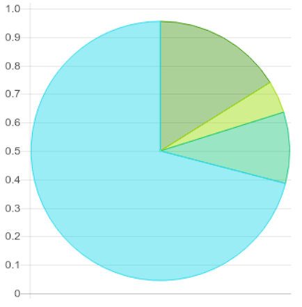
1. Pie
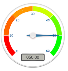
2. Gauge (max green)
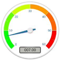
3. Gauge (min green)
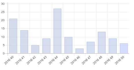
4. Bar chart
5. Line (Trend chart)
6. Doughnut
7. Area Stacked
8. Line Stacked
Create a new chart
Let's create a pie chart illustrating the distribution of tasks by department for a specified period.
- Step 1: Navigate to module Tasks.
- Step 2: Click the "wrench" icon located at the upper-right corner of the screen to open the right panel, then select "Dashboard".
- Step 3: Then click the "Create Chart" button. This will open a chart creation wizard as shown on Fig. 1.
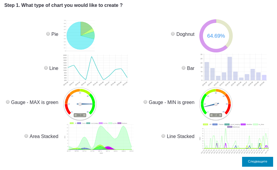
Fig. 1
- Step 4: Pick a chart type and click Next. Pop-up on Fig. 2 will appear.
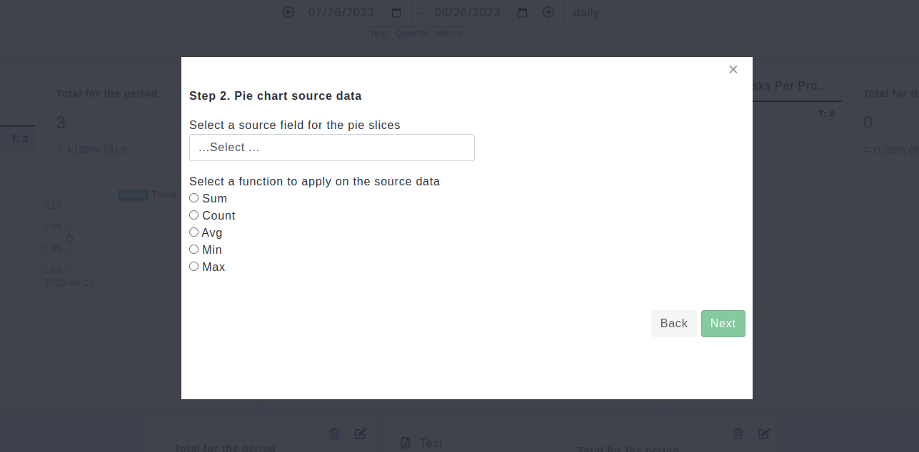
Fig. 2
- Step 5: Select "Department" from the drop down menu and "Count" as an aggregation function then click "Next" to complete the process.
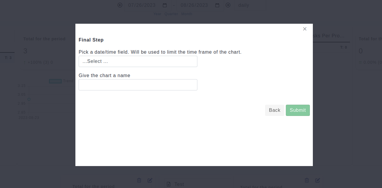
- Step 6: Select "Date/time field" from the drop down menu and give the chart a name. After that click "Submit" to create it.
Dashboard visualization
Once you've generated the desired charts, simply click the 'wrench' icon located at the top-right corner. Then, select 'Dashboard' from the options that appear. This action will open the dashboard, where all the charts you've created will be displayed.
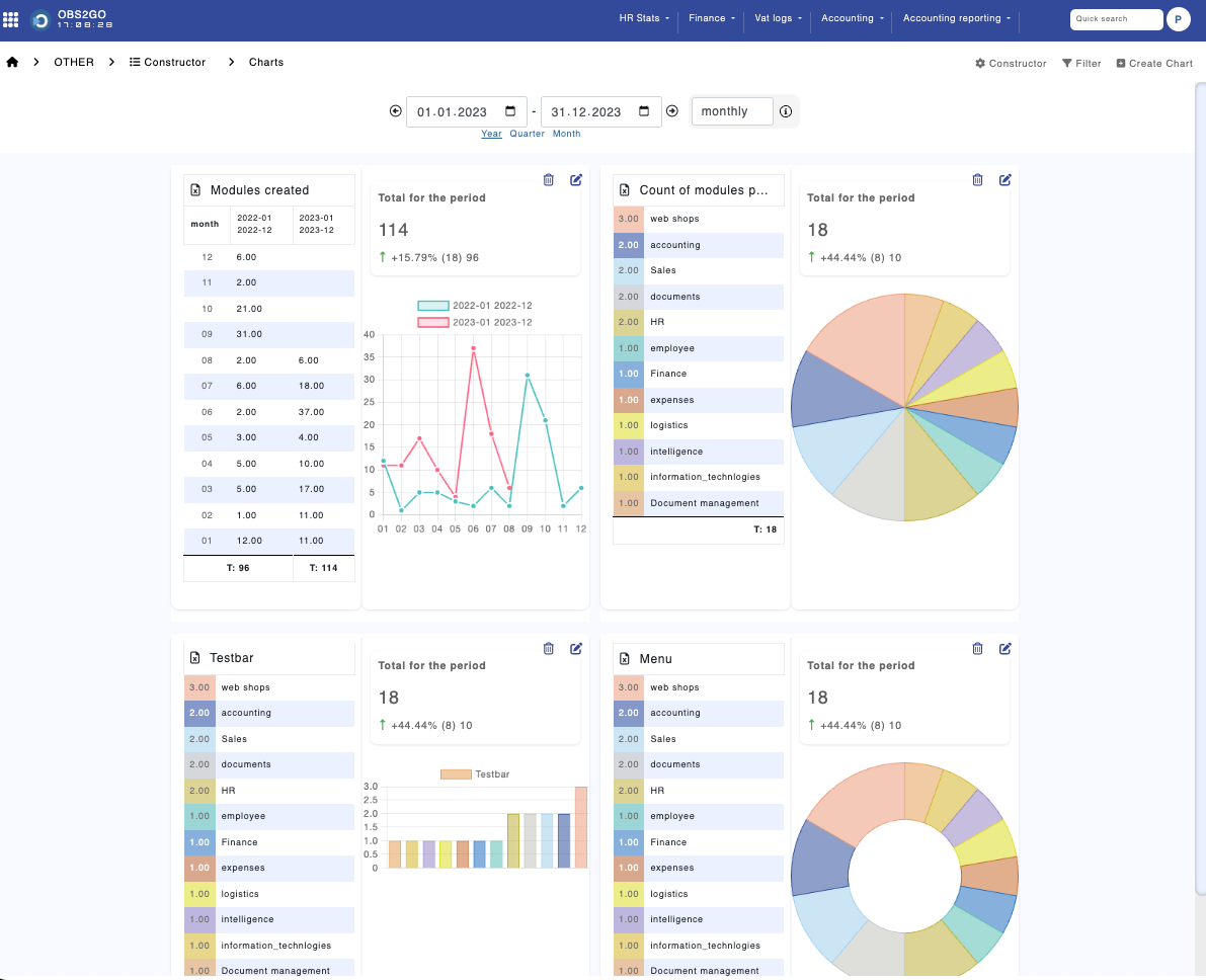
Furthermore, the dashboard will provide additional information about the charts, tailored to their respective content.
Conditional formatting
You can color part a chart in custom background color using the "Conditional formatting" function. To do that, click on the pencil above the chart you would like to modify. The following configuration page will appear (Fig. 3).
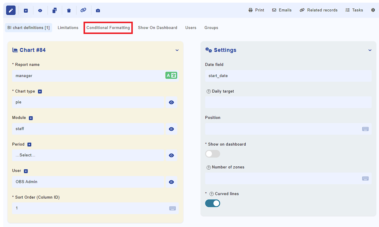
Fig. 3
Click the "Conditional formatting" button to create a new condition. For example, add a condition to color all tasks of category "Project task" in red. You need to make the following selection: pick x from the Axis pick list, the = sign as a condition and "Project task" for value. Then pick a color from the color picker.
Click "Add" to complete the step.
Source data limitations
In some cases, you would need to exclude the data used to produce a chart. For example, in module "Income" you might want to remove all invoices that are still not paid from chart "Income" chart.
Follow the following step to add source data limitation:
- Step 1: Press the pencil icon above the chart you would like to modify.
- Step 2: A form will show and at the bottom are the "Limitations".
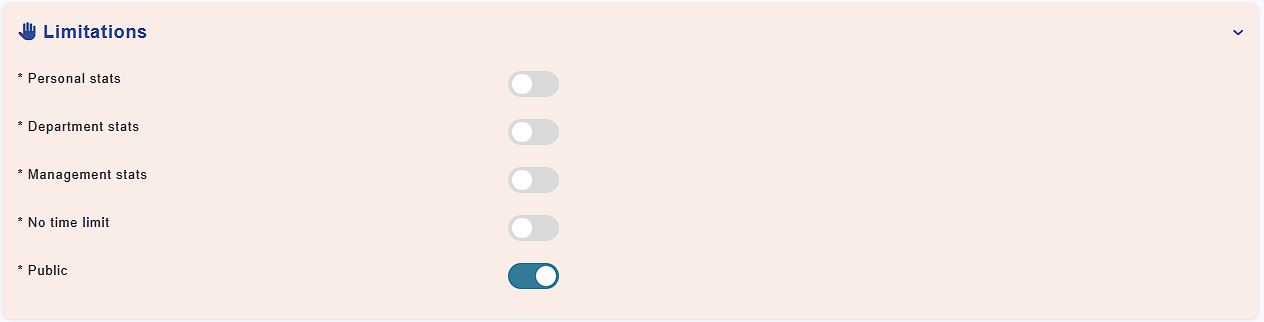
Fig. 4
- Step 3: Adding a limitation is done by selecting the corresponding buttons. All columns are defined in module "Constructor".
- Step 4: Press Save to complete the configuration.
Pivot tables
OBS allows you to create pivot tables using the data stored in the modules. This feature is available in the BI dashboard of each module via the 'Create Pivot Table' button.
Let's see this example:
Module: staff
Goal: create a pivot table showing the headcount by department
To create this report, click the 'Create Pivot Table' button, select 'department_id' in the 'First column of the table' field, and 'status_id' for the pivot column. Then, select 'Count' as the aggregation function and 'id' as the aggregation field and click "Add".
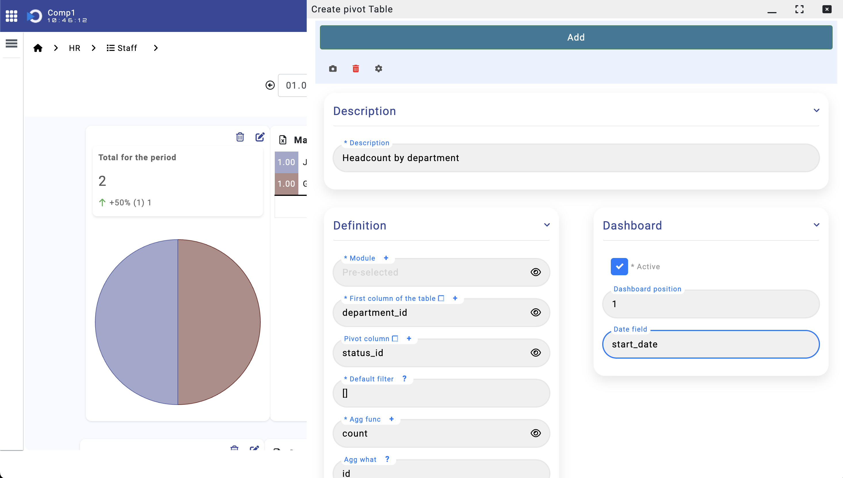
Fig. Pivot table configuration
Add the privilege groups that will be allowed to access this report:
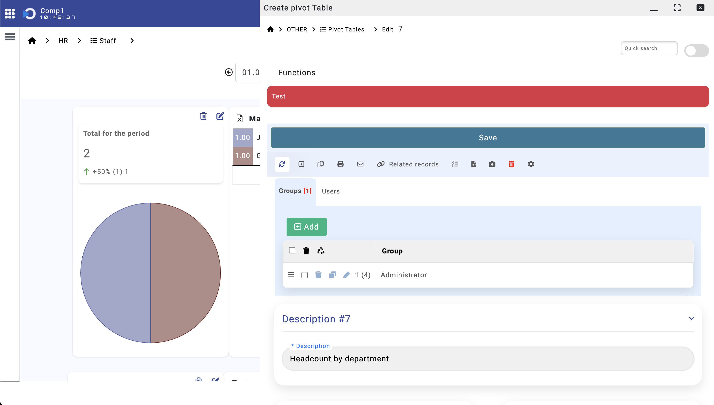
Fig. Pivot table - privileges and test
And click the "Test" button to test your configuration. Refresh the page and the report will be part of the dashboard
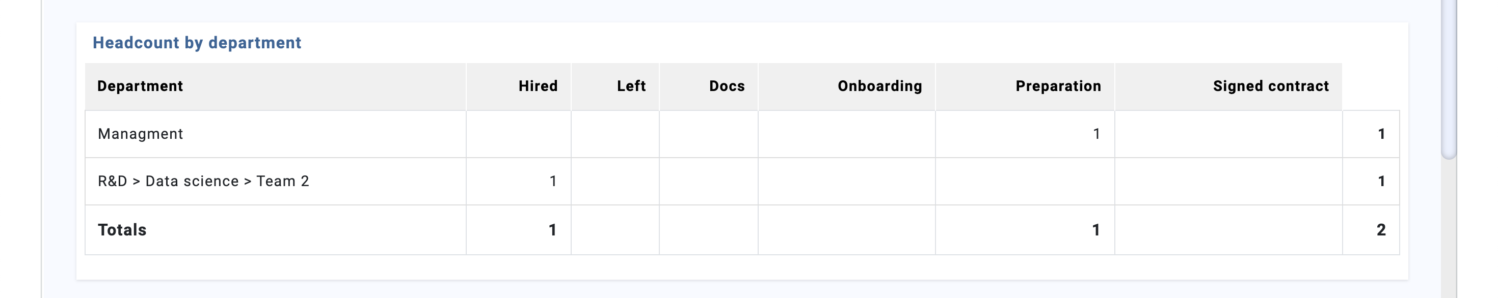
Fig. Pivot table